optimizing digital communications for today’s patients

learn to craft email and SMS campaigns that engage modern patient audiences
The modern patient's interaction with information has evolved, setting new expectations for healthcare marketers' communications. Crafting effective digital communications for today's patients requires a nuanced approach, accounting for “email scanners” and building layouts that get the point across in a few seconds. Adjusting for modern data ingestion habits will significantly impact patient engagement and conversion generated by your marketing campaigns.
what patients expect from their providers
With digital transformation on the rise, patients expect a new level of engagement from their healthcare providers. Beyond clinical expertise, patients desire frequent and relevant communication regarding their care in convenient and familiar channels. They seek personalized updates through email and SMS, with clear explanations of their treatment plans and proactive recommendations for next steps. Today’s patients expect healthcare providers to make it simple and convenient for them to take ownership of their healthcare journeys.
Because of these new patient demands, it’s vital to modernize healthcare communications and optimize email and SMS campaign creation to align with the needs and preferences of modern patients. Cured is on a mission to simplify this process for healthcare organizations and patients by providing straightforward and HIPAA-compliant digital marketing solutions that bring care full circle.
As you navigate optimizing digital communications for the modern patient, there are several key elements to focus on for email and SMS campaigns to keep your audiences engaged and coming back for more.

length
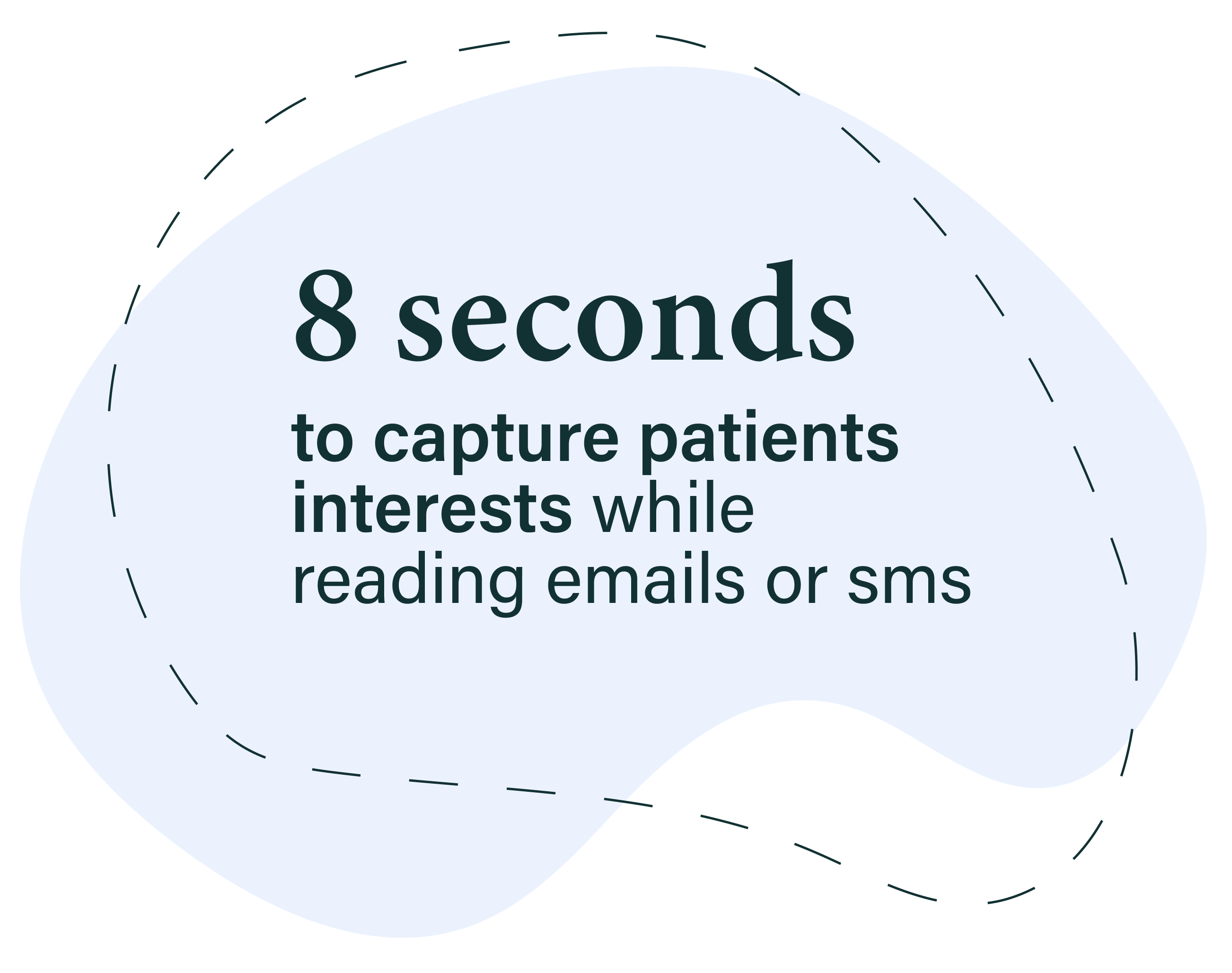
In a world of fleeting attention spans, keeping a concise length for your email or SMS is critical for capturing a patient's interest. Research highlights that you have a mere 8 seconds to make an impression. Modern patients are more likely to skim than read in-depth, so consider trimming introductory paragraphs and focusing on content chunks that stand out. Highlight key points in your campaign with images and whitespace for easier reading. It’s very rare for someone to read every word of an email, avoid vast blocks of text that can easily overwhelm, and include lots of supporting images and whitespace for easier reading.
layout
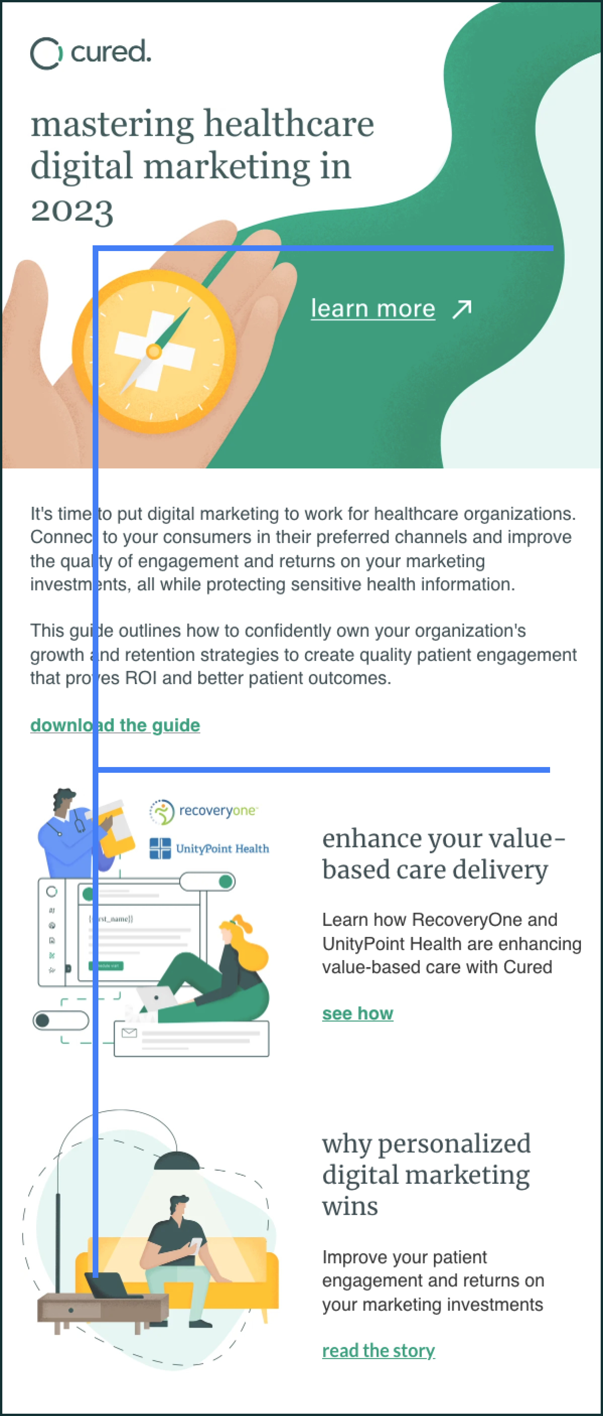
Layout plays a pivotal role in how patients consume email content. Instead of adhering to a linear reading pattern, studies show that people often “scan” emails in varying patterns for quicker intake of the email’s content. The most common “scan” pattern is an F-shape (pictured below). Other patterns often used are an inverted triangle and left-to-right scanning methods. To adjust for email scanning, it’s essential to structure your emails with clear headlines and concise points, addressing only one topic per chunk. Accompanying images are vital to enhance understanding and retention. By minimizing filler content and emphasizing the most critical information, you more effectively guide patients through their emails.

the do's and don’ts of “scannable” email
do
- simplify each chunk: address only one clear and concise point in each chunk
- create eye-catching headlines: use headlines as a roadmap to highlight what each section covers, helping scanners find the information they're seeking
- incorporate images: supporting images draw the eye and reinforce the message, making your email content more appealing and memorable.
- prioritize messages: place your most important statements first, leveraging the primary effect to ensure readers remember critical information.
- enhance middle content: While readers might consider middle copy secondary information, keep them engaged by using images, bullet points, numbered lists, and concise language.
don’t
- overload content: resist the urge to include too much information in a single chunk. Focusing on a single point in each section ensures clarity and prevents reader disinterest.
- misplace important messages: don't bury crucial details in the middle of your email.
- be afraid of whitespace: leveraging whitespace in your email allows for easier scanning, don’t be scared to use it to break up content.
- forget the p.s. line: adding a p.s. line at the end of your email capitalizes on the tendency for readers to recall content placed at the end.

frequency
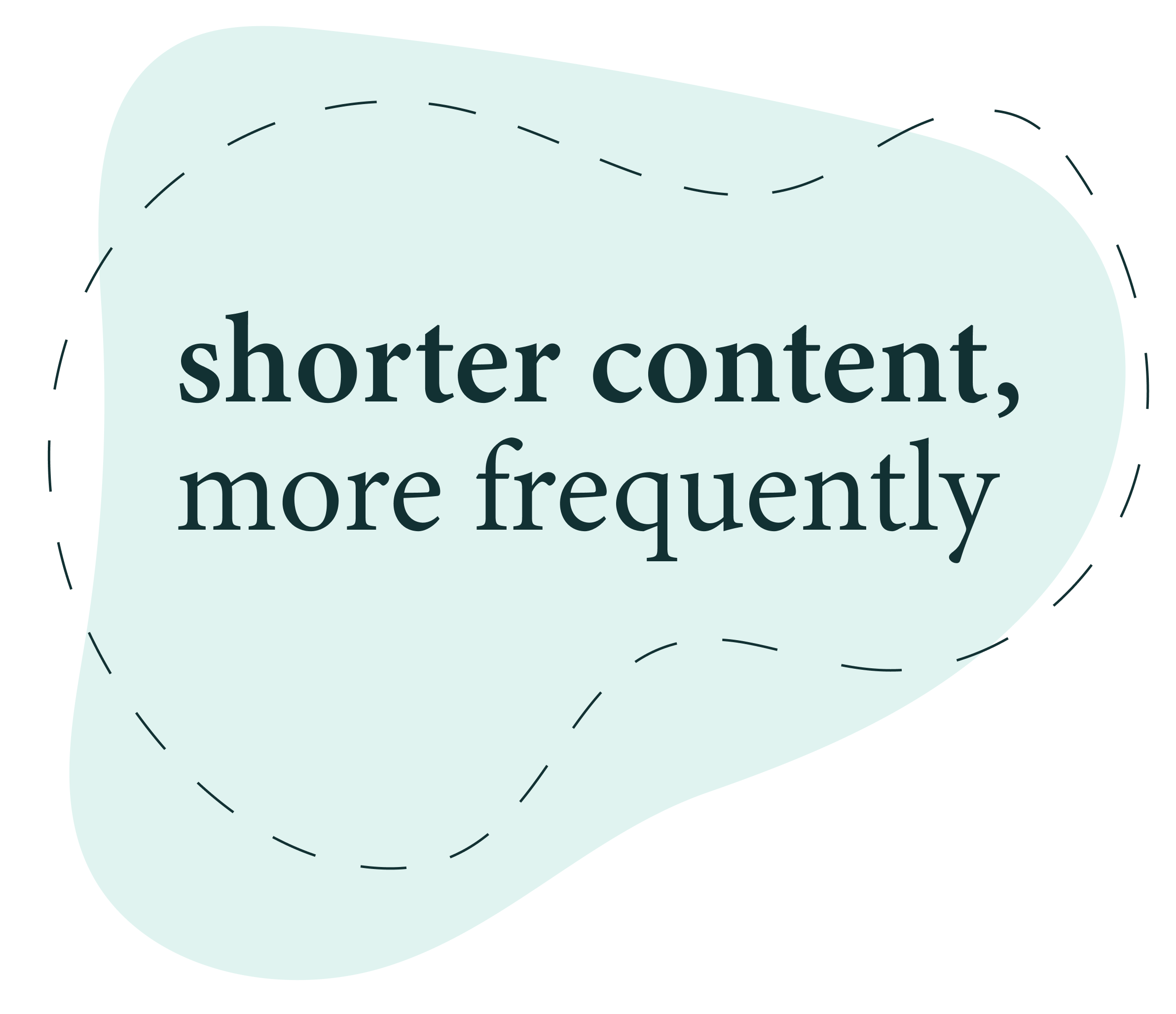
When it comes to campaign frequency, the mantra is “shorter content, more often.” It’s much more valuable to send out concise emails regularly and avoid lengthy or content-heavy emails. Break up your content into several emails or SMS campaigns. Concise emails and texts are far more digestible and much more likely to be read, making communicating your important call-to-actions (CTAs) and messaging easier. This approach also respects patients' time and aligns with their preference for quick updates. Streamlining your content and maintaining regular communication creates a sense of ongoing engagement and keeps patients informed without burdening their inboxes.
Learning the modern patient's communication preferences is critical to crafting impactful healthcare digital communications. Incorporating “scan-friendly” techniques, easy-to-read layouts, and concise yet regular campaigns can help you meet patients where they are in their digital journey. Mastering modern digital communication best practices fosters engagement and will generate long-lasting patient relationships.
discover our library of 80+ pre-built, optimized campaigns.


